


If we were to split the creative process into three sections — content,
design, and outreach strategy — how are we able to engineer our own
successes and failures to provide us with a framework for future
campaigns? From the amount of data
used and visualized to the importance of effective headline
storytelling, the insight is a way of both rationalizing and reshaping
our approach to content production.

1. Insufficient data:
Behind every great piece of content is (usually) a unique or noteworthy set of data. Both static and interactive content enables us to display limitless amounts of research which provide the origins of the stories we try to communicate. However many figures or metrics you choose to visualize, there is always a point where a journalist or reader switches off.
2. Powerful data visualizations:
Regardless of how saturated the content marketing industry becomes, we are graced every year with new and innovative ways of visualizing data. The balancing act between originality in your design and an unnecessarily complex data-visualization is often the point on which success and failure can pivot. As is the case with data, overloading a piece of content with an amass of multi-faceted graphs and charts is a surefire way of alienating your users, leaving them either bored or confused.
3. Pandering to the press:
Competition means that press contacts are looking for something extra special to warrant your content’s publication. While ingenuity is required in every area of content marketing, it’s equally important to recognize the importance of getting the basics right.
Source: SearchEngineWatch
 To Generate Leads")
![How to Ask For A Raise To Your Boss [Infographic]](https://blogger.googleusercontent.com/img/b/R29vZ2xl/AVvXsEiA0s-zWcYGbGxigViUk4SzAwxqxpa3bY37KGee8eDIaL5CfqMA8hm30KScdA5CmlitXaSRjDaCcRJDASJJIBxZzghMphHevHoWx_mXEHTBXLl9AlA5yBF5lI60Tt-U49KDZp9uo0aJEPEM/s1600/ask-for-salary-raise.png "How to Ask For A Raise To Your Boss [Infographic]")


![9 bad habits at work and how to fix them [Infographic]](https://blogger.googleusercontent.com/img/b/R29vZ2xl/AVvXsEgJ00ORjgiNkJzL466mIq7FJu340coaIK1JA1Ei4DryxsY9y9WeDDvzkTao3_DgnF2qXzpjE0-2FB31T652O7EE60OFDrOG_28xnaJahRCDh2VY8H_EYmmBqQm3Ktap_WAU_j6WJ7G_amJc/s1600/9-bad-habbits.jpg "9 bad habits at work and how to fix them [Infographic]")


![7 Dirty Secret Of Google That You Should Know [Infographic]](https://blogger.googleusercontent.com/img/b/R29vZ2xl/AVvXsEi7nzY55rhOAcDtbw-hTSL_vCcfm-7JnysMZ2byYtIL_-oC0X0s8pjEHTvkatFceaQCXDW7zPRDMVw8tSro_7XzOgmUzYAZaqdbl3vnXkBoXRs_5l8y6XrIWJbYiFzQmO8q5lK0jywKT9Np/s1600/7-dirty-secret-of-google.jpg "7 Dirty Secret Of Google That You Should Know [Infographic]")


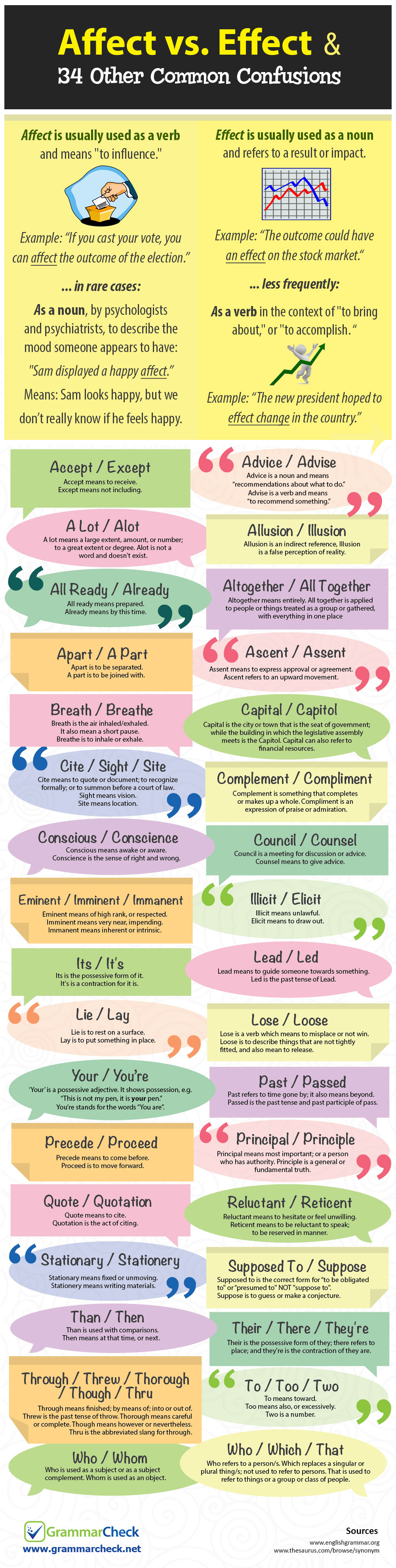
![Common Confusing Words in English [Infographic]](https://blogger.googleusercontent.com/img/b/R29vZ2xl/AVvXsEhjwC8BpZorzLRh_LKFpm8w6kMC3zKPUuik9nvU72249CVS2esm9cFmqchueCtscTuLiD-EIoDSLX-oZa1xrAAHs3q0rgnlmWKxxbR9SBKUG6nOeBB0AXXvOkJfqaLxsHBvYwrNIN7MG1Vn/s1600/Commonly-confused-words-and-used-mistakes.gif "Common Confusing Words in English [Infographic]")
![20 Do's And Don'ts Of LinkedIn Etiquette [Infographic]](https://blogger.googleusercontent.com/img/b/R29vZ2xl/AVvXsEiO9h8cvvcMXYLNaWbYhvCST1dsvygAOYT_G_VLBg9B3vaa3_67Bei6wqdzGvJEUTDyB8n02z_oNtsqm4fjc6t7t-5XhDA6V3CmGfIMTv02n-uhMThatH-Xm2bM1gormYkuIF4TKg1hgQMQ/s1600/20-dos-and-don%2527t-of-linkedin-etiquette.png "20 Do's And Don'ts Of LinkedIn Etiquette [Infographic]")
![LinkedIn Etiquette Guide 2017: 20 Do’s & Don’ts [INFOGRAPHIC]](https://lh3.googleusercontent.com/blogger_img_proxy/AEn0k_uo4nybLF0_LZpbp5oi8EVvx-mD5mYkHqakIu7_H4-oL76hTFdedqnwKwRazTYlCh12sji-zWsk3-4vUtgcF_M-fqrA680Q3mky8uC9IGdBHG5O3hVtigfAY0wMGq5KfV163WxnBqKKD2FFtKOSHb7o4vlPJkYhWP2qav5QuJY=s0-d)
 Recent
 Tags
Tags Popular


